case study · Raising Cane's
Raising Cane's Mobile App: Making the App Worth Opening
On a three-person team redesigning the Raising Cane's app, I designed the rewards experience and led research synthesis, after our survey showed most customers had never opened the app.
Overview
- Role
- Rewards experience design, research synthesis and the team style guide
- Team
- Me, MK and Anashen
- Timeline
- 2 months, Jan to Mar 2026. Rebuilt in Oct 2026.
- Methods
- Competitor analysis, survey, informal user sessions, personas, journey maps, Sprint methodology, usability testing
- Tools
- Figma, plus Claude for the rebuild
- Context
- Student team project, not affiliated with Raising Cane's
The hook
Nearly 70% of the people we surveyed had never opened the Raising Cane's app. Not "tried it and left." Never opened it.
That number reframed the whole project. The question wasn't how to polish an app people were struggling with. It was why a beloved brand's app gave customers no reason to show up in the first place.
Context
Raising Cane's has intense brand loyalty and a famously simple menu, but its mobile experience hasn't kept pace with the rest of the industry. Competitors like Chick-fil-A, Sweetgreen, Chipotle, and Taco Bell now take a large share of their orders through their apps, built on rewards programs and streamlined reordering that make the app the default way to buy. Cane's doesn't report comparable digital metrics, which suggests mobile ordering isn't yet a core part of its ecosystem.
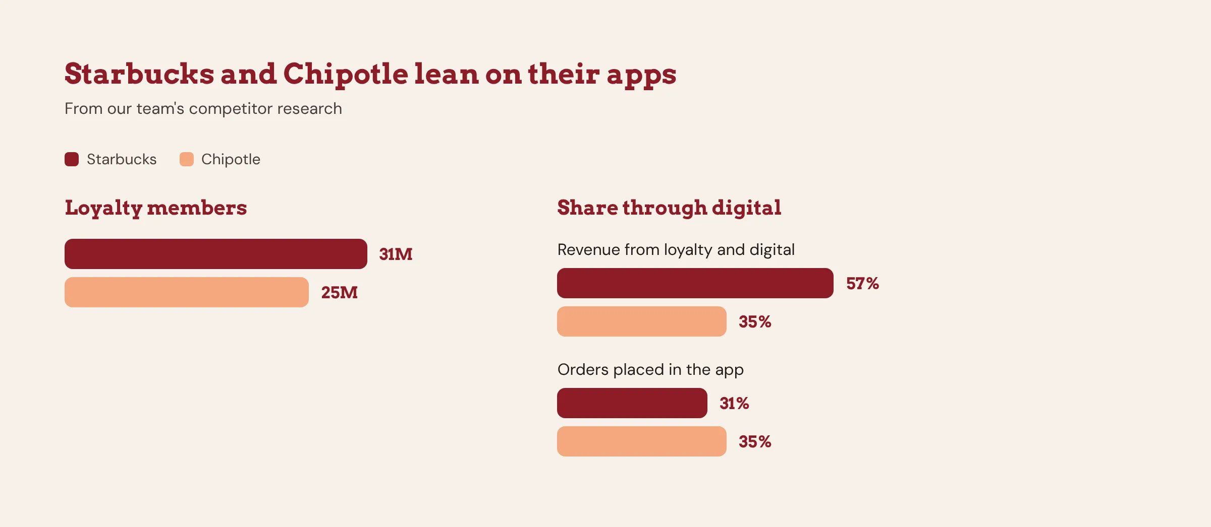
This was a student project, not a client engagement. We had no access to Cane's internal data, so we treated our recommendations as research-backed hypotheses rather than a verdict on their strategy.
Research
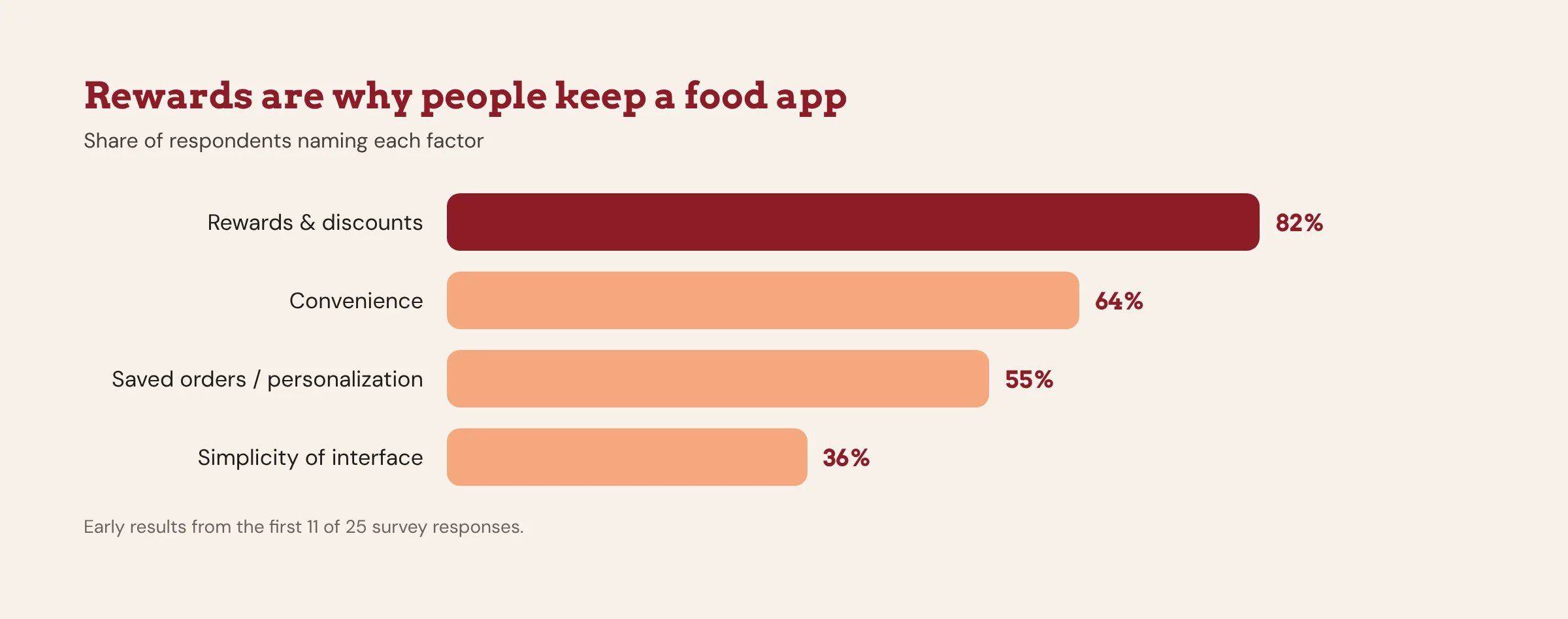
We surveyed 25 participants, recruited through personal networks and Reddit outreach, alongside a competitor analysis of Chick-fil-A, Sweetgreen, Chipotle, and Taco Bell. From there we built personas and journey maps to trace where the experience broke down.
What we found:
Over 80% of participants named rewards and convenience as the most important factors in choosing to use a food app. Nearly 70% had never used the Cane's app at all. Among those who had, the recurring complaints were a lack of incentives and poor support for quick repeat ordering. The single most cited gap was the absence of a rewards program, which users have simply come to expect.
We supplemented the survey with informal sessions with two current Cane's app users. Their feedback was blunt: the app felt half-baked, lacking direction and design. Hearing that unprompted from people who had actually adopted the app confirmed that the problem wasn't just awareness, it was value.
Defining the problem
We synthesized the research into three friction areas:
1
No motivation to engage.
With no rewards system and no visibility into value, customers had no reason to open the app.
2
Friction in repeat ordering.
Inefficient shortcuts and unclear system feedback made reordering harder than it should be for a menu this simple.
3
Confusion at checkout.
Missing progress indicators left users unsure where they were in the flow, contributing to cart abandonment.
Each of us took ownership of one area. I led the rewards system integration. MK designed personalized reordering shortcuts, and Anashen redesigned the checkout flow.
My design: the rewards experience
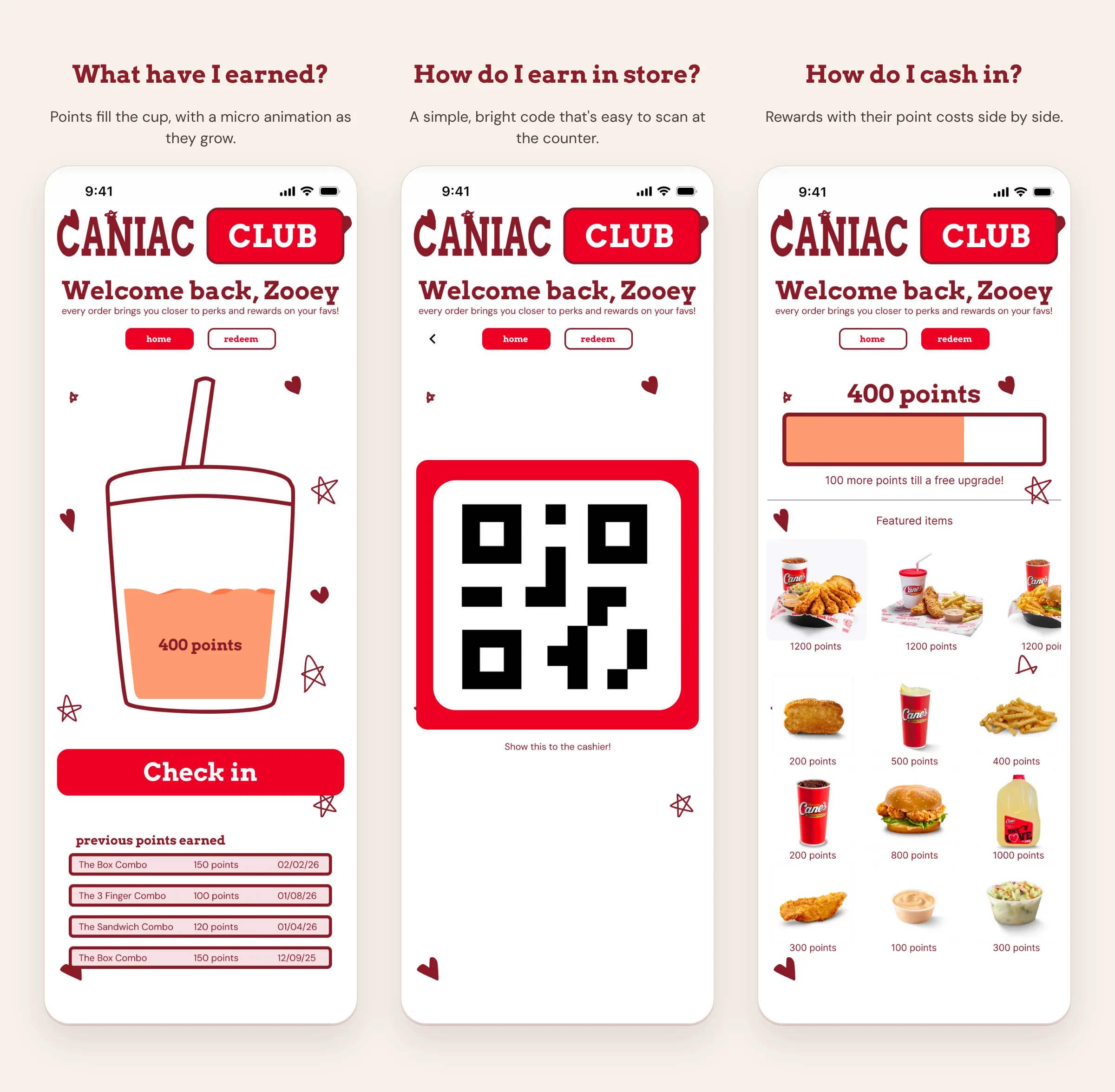
I designed three connected screens, each answering a question the research surfaced.
"What have I earned?"
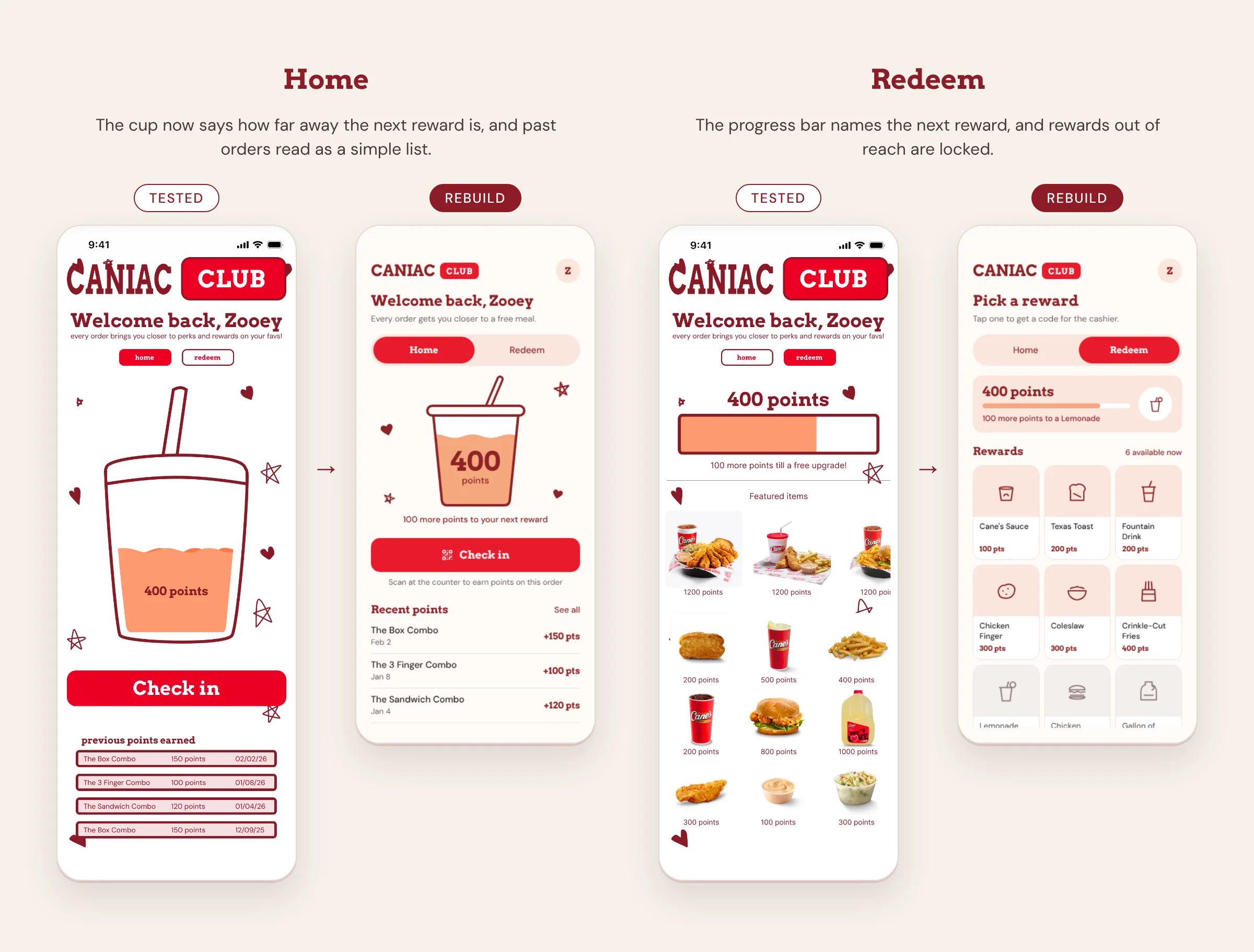
The rewards home shows total points, a clear progress indicator toward the next reward, and an entry point to check in. This directly targets the visibility problem: the value of using the app is legible the moment it opens.
"How do I earn in store?"
A dedicated check-in screen presents a scannable code with nothing competing for attention, because the real-world context is a customer standing at a counter with a line behind them. Speed and clarity are the whole design.
"How do I cash in?"
The redemption screen lists available rewards with point costs side by side, so there's no guesswork about what users can get or how close they are. Removing that ambiguity lowers the effort of engaging at all.
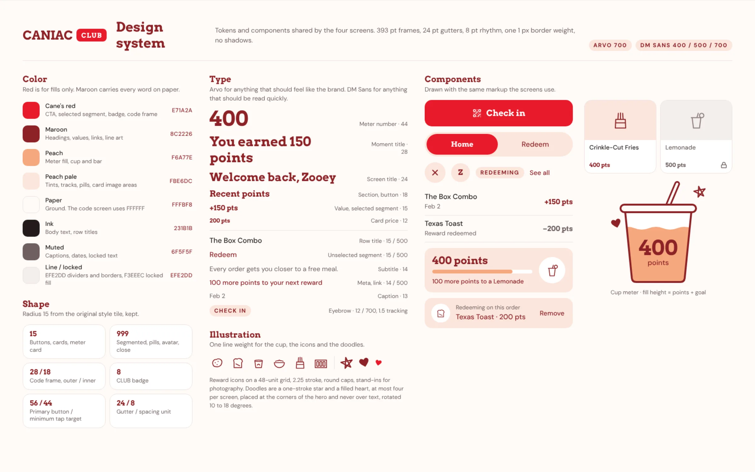
I also made the team's style guide: Arvo Bold and DM Sans type, the color palette, button states, and the small star and heart elements we used across all three redesigns. It tied our separate flows together visually.
Testing the rewards prototype
I wrote a usability test plan for the rewards flow and tested it with 10 participants on three tasks: reading the rewards summary, browsing available rewards and checking in to earn points. Most participants found their rewards and reached the redemption screens without help.
What worked:
- The point balance animations made progress feel alive, and participants liked them.
- The screens were clear and asked little of people, so they were quick to scan.
What didn't:
- Some participants wanted a clearer breakdown of how points are earned and allocated.
- Some wanted more immediate feedback on when their next reward would arrive.
Rebuilding after testing
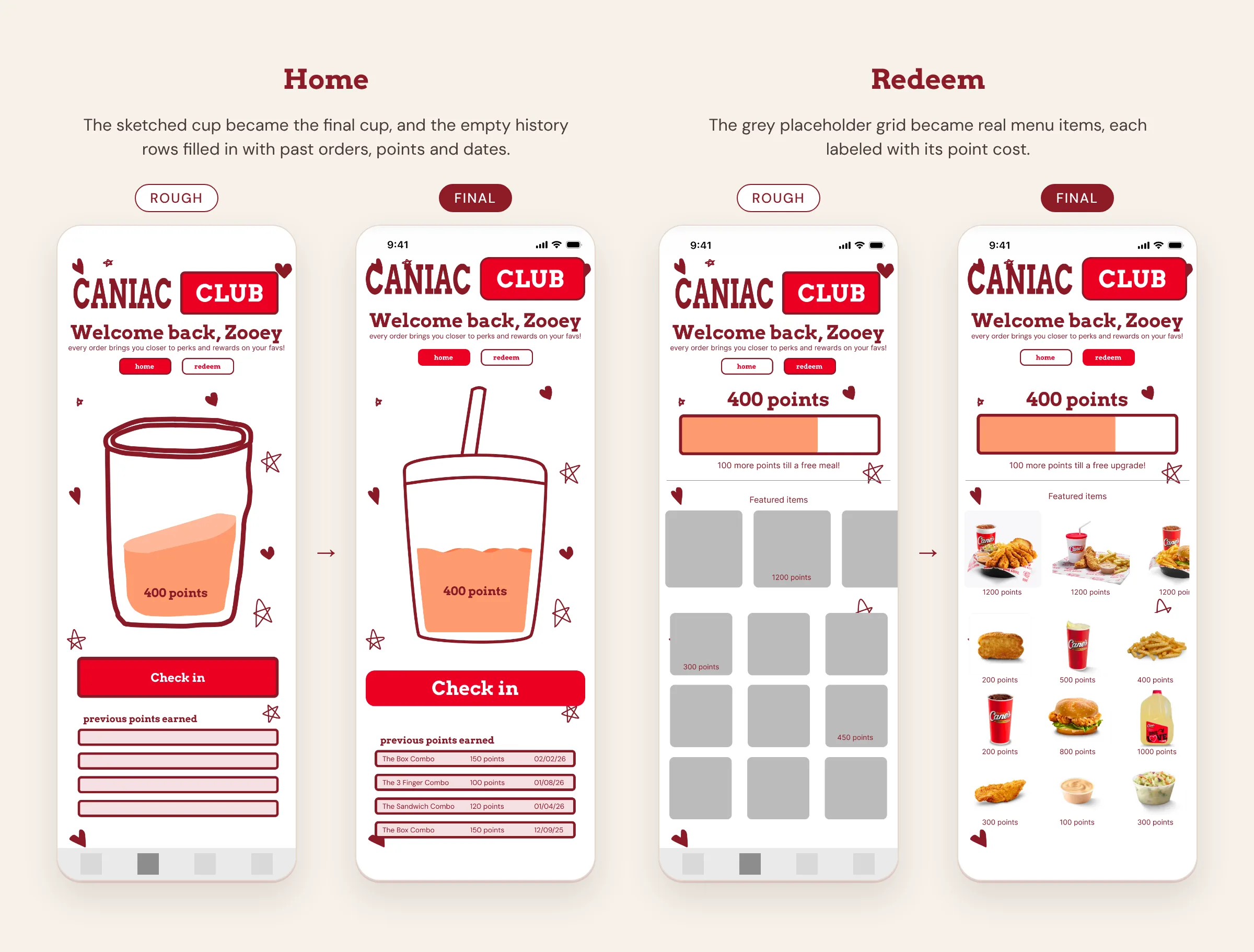
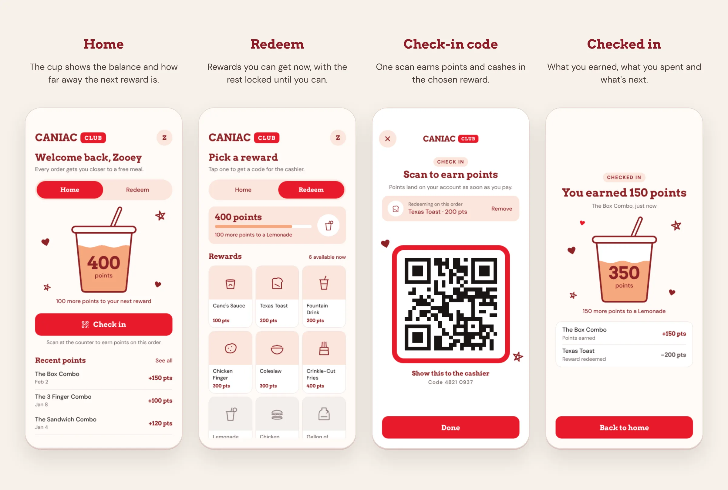
After the course, I rebuilt the rewards flow around what testing surfaced. Three screens became four, held together by a design system.
A clear breakdown of points.
A new "Checked in" screen appears after each scan. It lists the points the order earned (+150 for The Box Combo) and any reward used on it (−200 for Texas Toast), so the new balance never comes as a surprise. The home screen keeps a list of recent points by order and date.
The next reward, always in view.
Every screen says how far away the next reward is, and names it where it can: "100 more points to a Lemonade" while picking a reward, and "150 more points to a Lemonade" right after checking in.
One code to earn and redeem.
Picking a reward attaches it to the check-in code, so one scan at the counter earns points and cashes in the reward. Rewards that cost more than the balance stay visible but locked.
A design system instead of a style tile.
I grew the original style guide into a design system: Cane's red only for fills, maroon for every word, one line weight shared by the cup, icons and doodles, and the 15 pt corner radius kept from the original style tile.
Reflection and next steps
Testing showed people understood the rewards screens. It couldn't show whether rewards change how often people order. The rebuild answers both pain points from testing, but it hasn't been tested yet, so the next step is a second round of testing on the new flow. Then I'd want order data to size the opportunity, which is the kind of constraint you inherit when working outside a company.
What this project taught me is that the most valuable research finding is sometimes an absence. Seventy percent of people not opening your app isn't a usability problem, it's a value proposition problem, and no amount of interface polish fixes it. The design work had to start with giving people a reason.