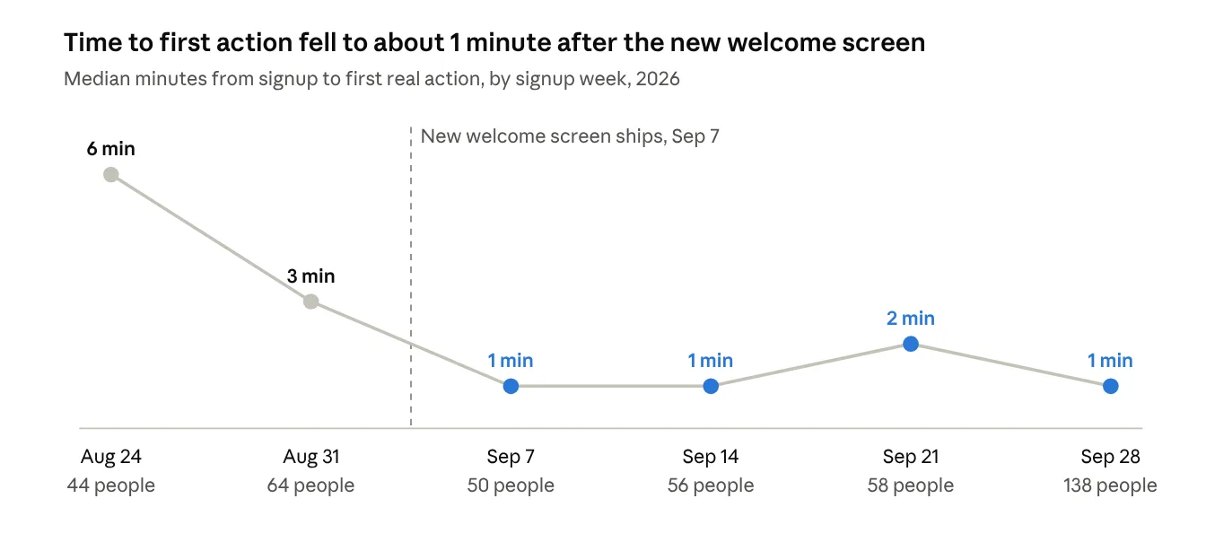
I redesigned the first screen of Mookti, an AI study app, so new learners could start working with Ellen, its AI tutor, before making an account. After the new screen shipped in early September 2026, the median new account reached its first real action in about 1 minute, down from 3 to 6 minutes.
Overview
Mookti pairs students with Ellen, an AI tutor who helps them plan, learn and stay on track. I lead its design, from the logo to the screens.
Role
Founding Designer: UX, UI and research
Project
First-screen and onboarding redesign
Timeline
Aug to Sep 2026, shipped Sep 7, 2026
Team
Me and Emmy Kumar (founder)
Tools
Figma and Claude
Platforms
Web, iOS and Android
The problem
Mookti's first onboarding was too long and too restrictive. The old welcome screen offered about 12 choices, and most guests left without clicking any of them.
That first screen is where people decide. Since launch in August, 65% of guest visits have lasted under a minute (1,930 of 2,956), and only 16% did anything at all.
My goal for the redesign: get every guest to send Ellen a first message, without making them wait, sign up or read first.
Principles
Three ideas shaped every decision that followed.
1
Ellen comes first.
She is the product, so she belongs front and center on the first screen.
2
Try before you commit.
Everything works before you make an account. The account is how you keep what you made.
3
Show, don't tell.
Real content and real interactions do the explaining, not instructions.
Iterations
The design took four rounds before launch and one after, and two of the most important changes were cuts.
1.
Two directions, one opening line.
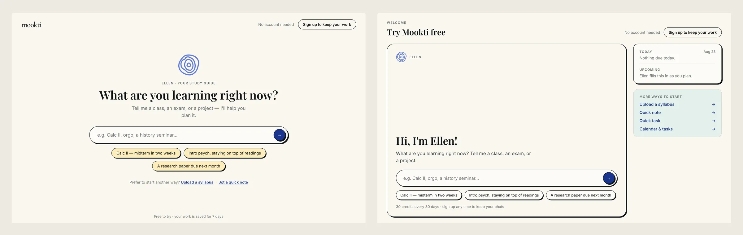
Both started with Ellen asking "What are you learning right now?" A, an Ellen takeover, made the chat the whole first screen. B kept the dashboard but gave Ellen one dominant card and demoted everything else. I also prototyped a connected flow that started in A and landed on a B-shaped home. I chose B because A felt too restrictive.
Direction A, an Ellen takeover, next to direction B, the dashboard with one dominant Ellen card2.
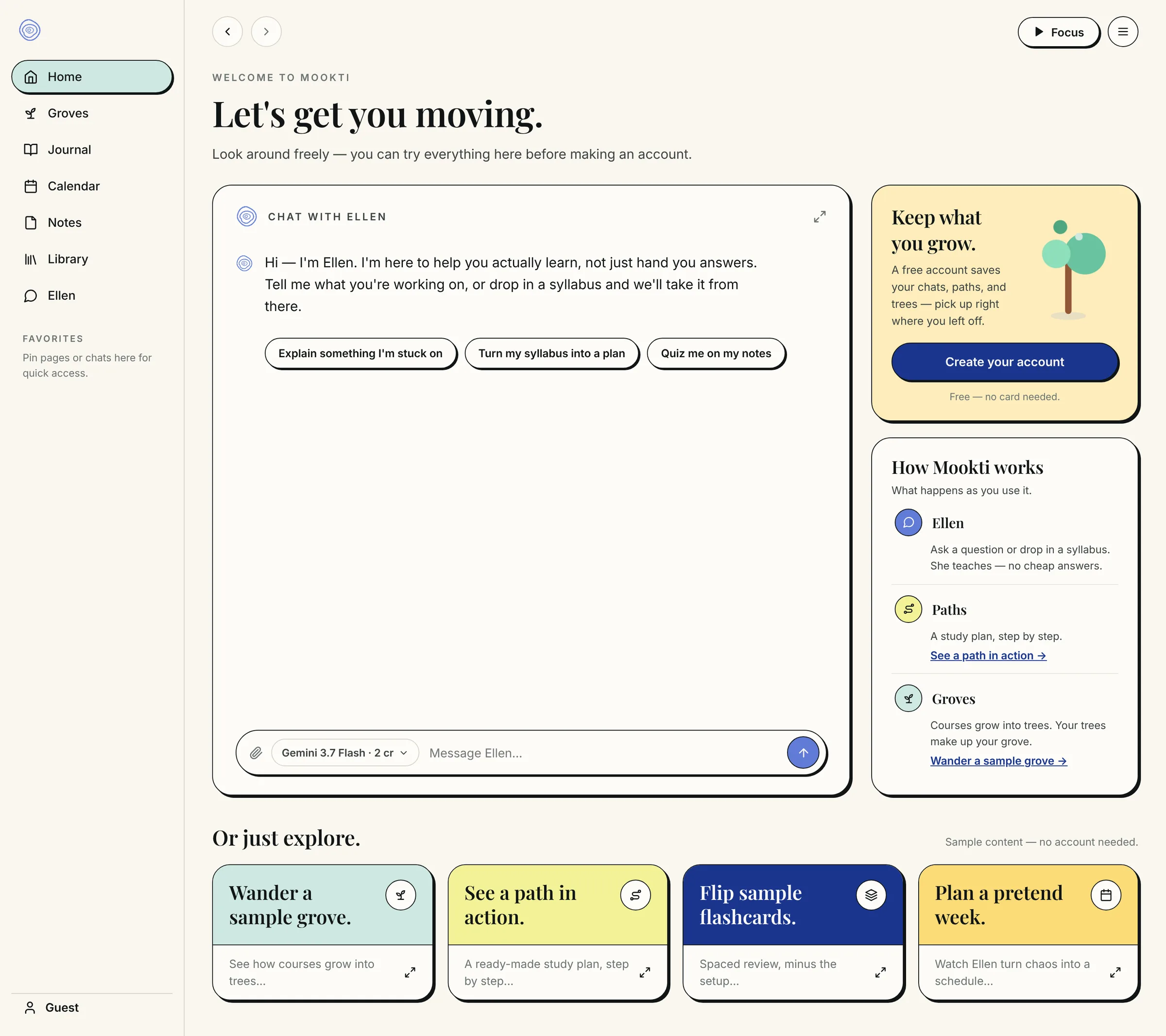
One welcome screen, usable without an account.
Ellen sat front and center with three suggestion chips. A "Keep what you grow" card invited people to make an account, and an "Or just explore" row offered sample content: a grove, a learning path, flashcards and a pretend week.
3.
A checklist, then an accordion.
A "First steps" checklist (0 of 4) guided people at first. I wasn't sure it helped, so I tried a "How Mookti works" accordion explaining Groves, Ellen and Paths instead.
The welcome screen with the "How Mookti works" accordion
4.
Cutting the accordion.
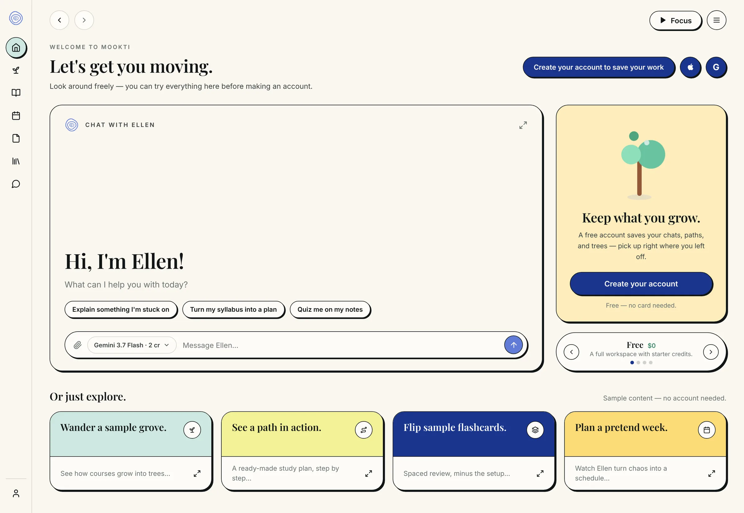
It repeated what the explore cards and Ellen already showed. I removed it, enlarged the "Keep what you grow" card and added a small flip-through preview of plans, free tier first. This version shipped on Sep 7. It opened with "Let's get you moving" and told people they could try everything before making an account.
The welcome screen that shipped on Sep 7, 2026
5.
Onboarding inside each page.
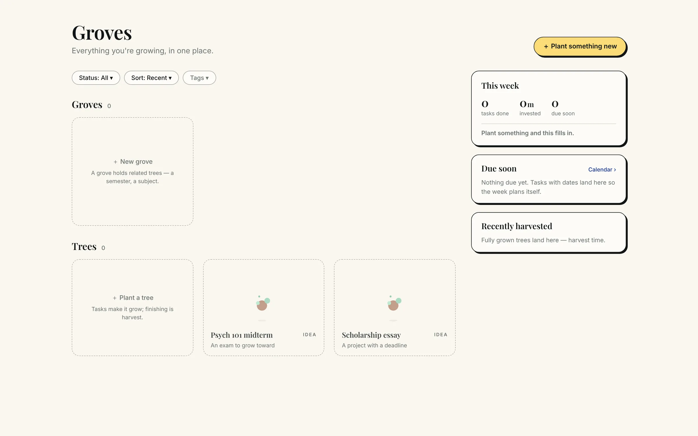
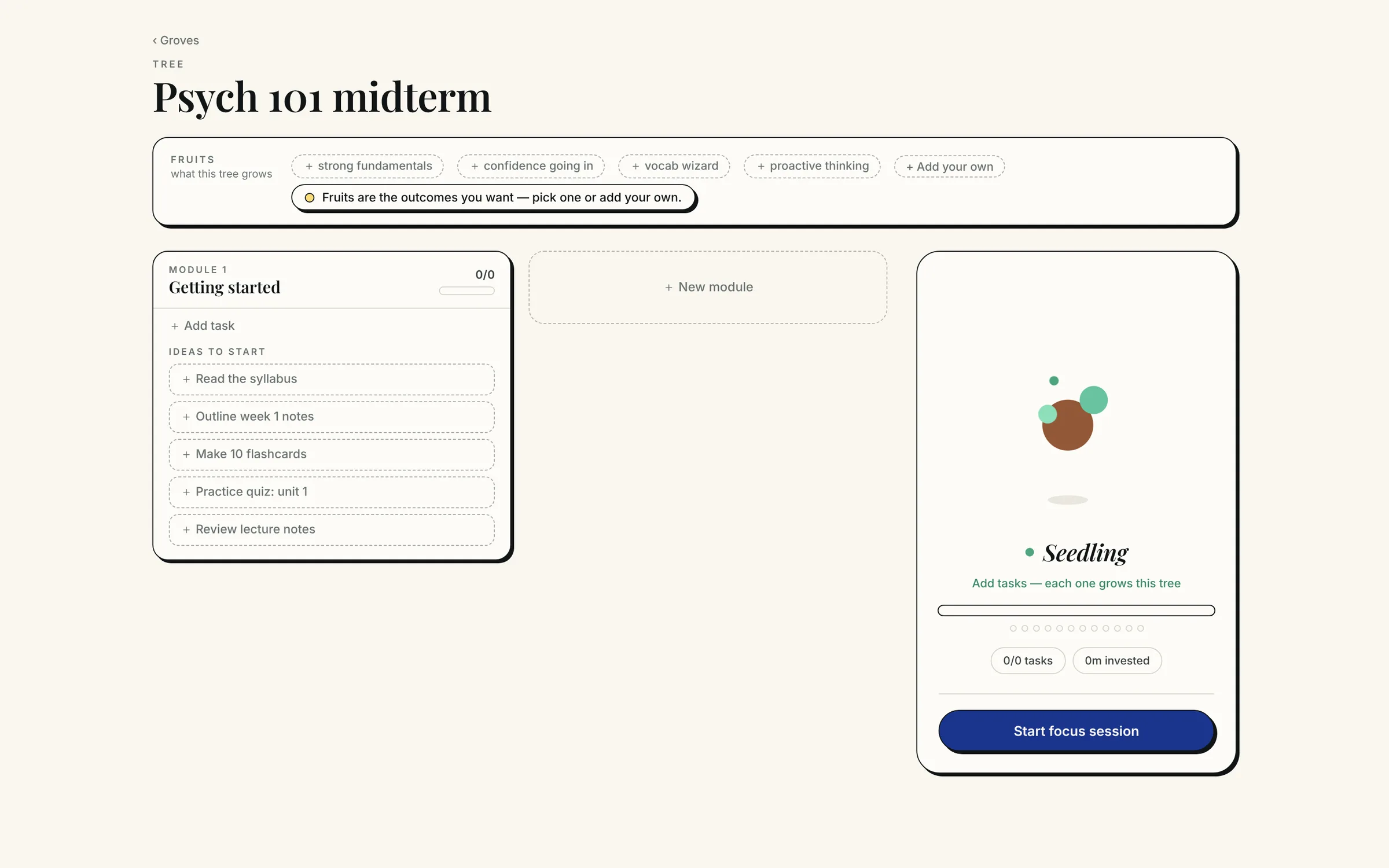
After launch, I took the same idea into each page: no tour up front. Short guide text sits in the empty areas where people add content, starting with Groves.
The empty Groves page, with guide text in each empty area
A first tree on the Groves page, with suggested goals and starter tasks
Outcome
New accounts reached their first real action faster.
Source: Mookti admin dashboard, signup weeks Aug 24 to Sep 28, 2026.
Other signals from the first eight weeks:
→62% of new accounts took a real action, such as chatting, uploading or planning (418 of 677).
→Chatting with Ellen was a first-day action for 60% of them (252 of 418), which supports putting her first.
→22% of new accounts started as a guest (143 of 650), so trying before signing up brought in real signups.
The weekly groups are small, 44 to 138 people, so I treat this as an early signal rather than proof.
The bigger picture
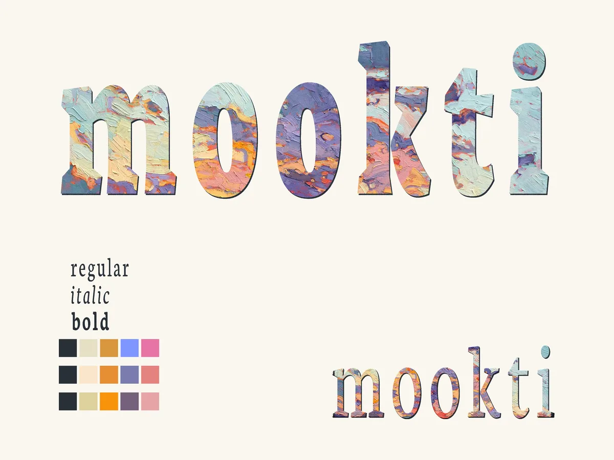
Onboarding is one part of Mookti's design. I built its whole visual language, from the first logo sketches in 2024 to v4.
Dec 2024: first logo explorations
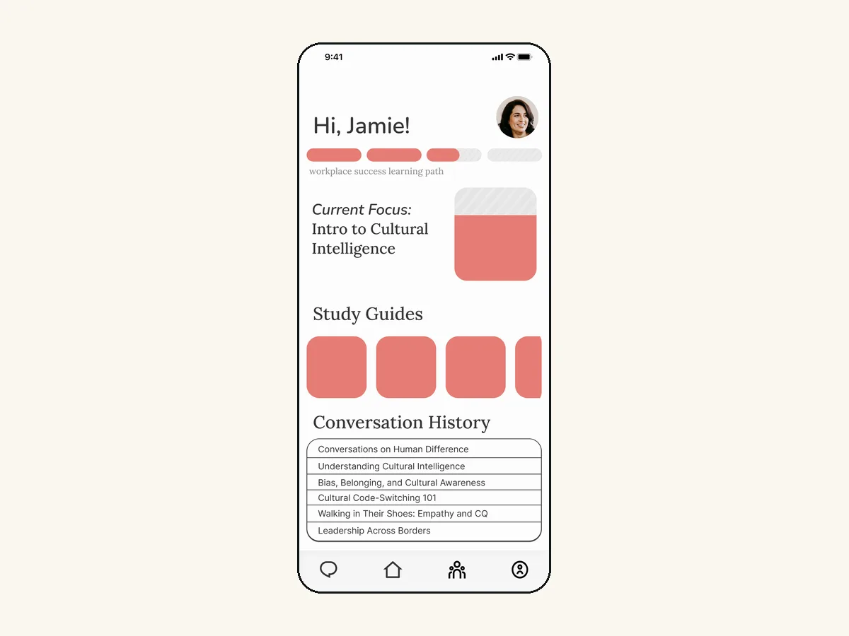
Aug 2025: early app mockup in a coral palette
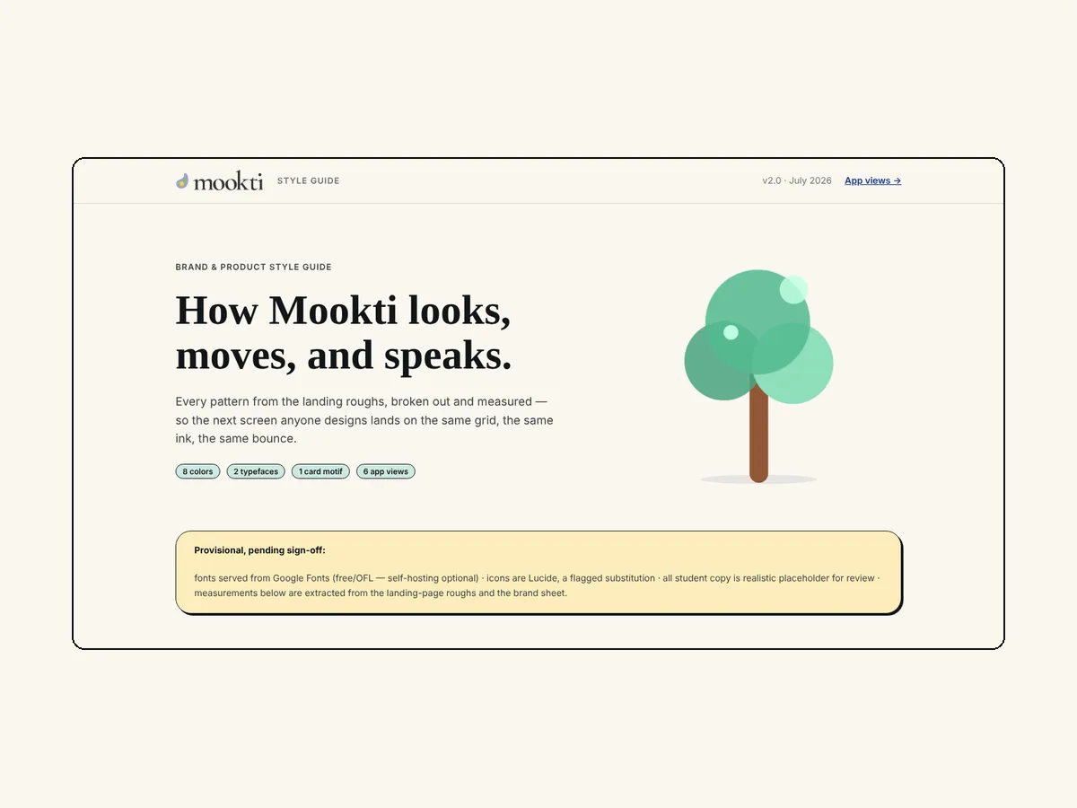
Jul 2026: style guide v2
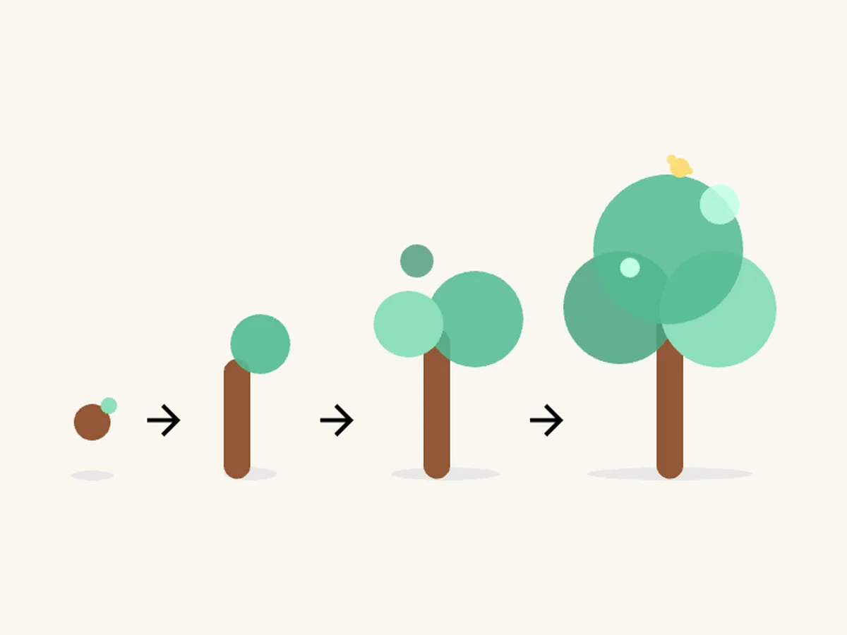
Aug 2026: growth tree system
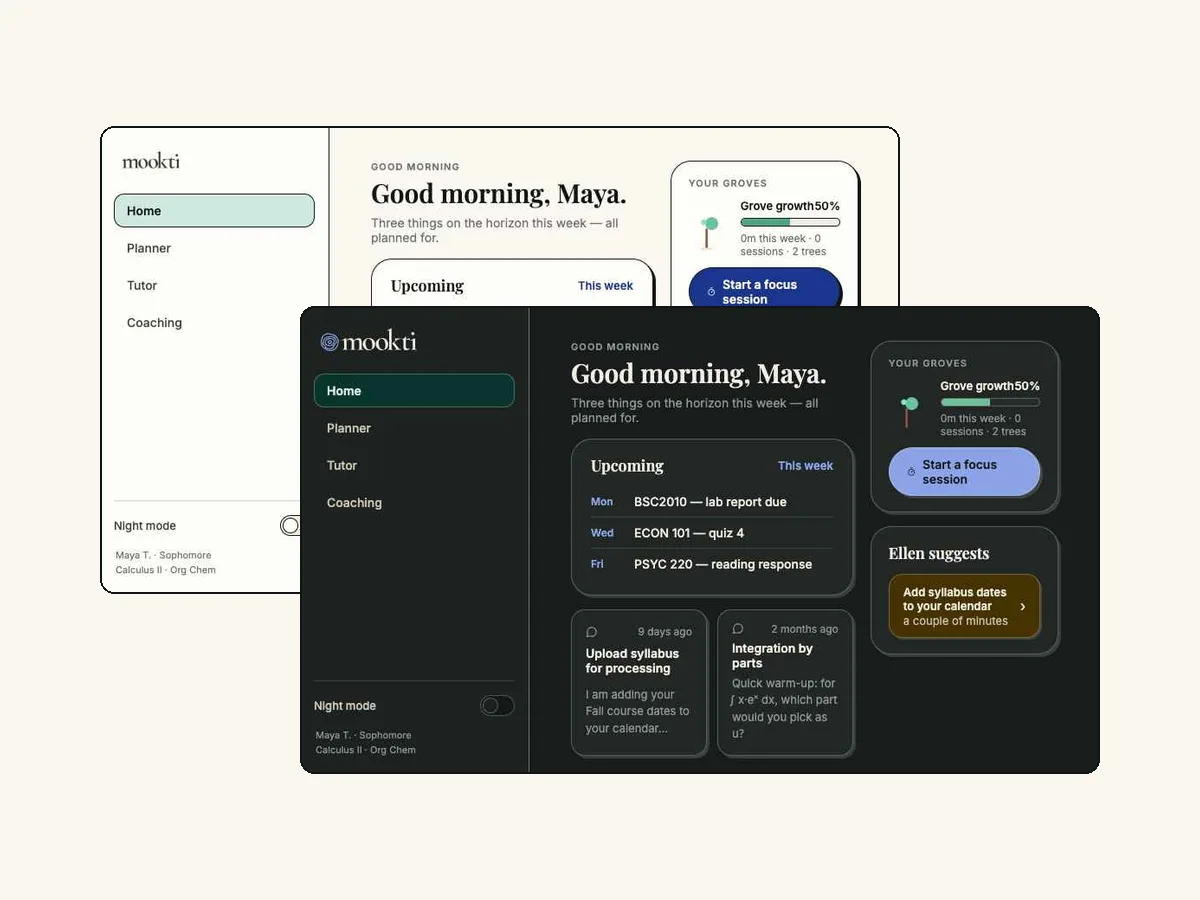
Aug 2026: night mode, light and night
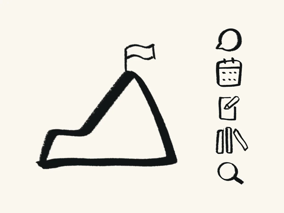
Oct 2026: v4 summit mark and hand-drawn nav icons
What's next
Mobile is the next problem. 80% of guests arrive on a phone (2,380 of 2,956), but desktop guests did something at twice the mobile rate (28% vs 13%) and made accounts about 8 times as often (20% vs 2%).
Mookti v4 launches in mid-October with Goals replacing Groves, so the page-level onboarding pattern moves to Goals next.
What I learned: Cutting mattered as much as adding. The checklist and the accordion both explained what Ellen and the explore cards already showed, so removing them let learners experience Mookti for themselves. Ellen and the sample content guide, and learners discover the rest by doing. I plan to bring the same approach to onboarding for Goals in v4.