case study · Depop
Depop: showing the real total before the deal feels done
I proposed two small changes to Depop's checkout so buyers see their real total, including tax, before they make an offer or buy. Both use Depop's existing interface: no new screens and no redesign.
Overview
Depop is a secondhand marketplace where buyers browse, make offers and buy from small, personal shops. This was a solo UX sprint, done independently of Depop.
- Role
- UX designer, solo: research, design and presentation
- Project
- Checkout price transparency
- Timeline
- May to Jun 2026
- Methods
- Flow audit, competitive benchmarking, task-based observation and interviews, secondary research
- Tools
- Figma and Google Slides
- Platform
- Depop mobile app
The problem
Shopping on Depop feels like a garage sale: browsing, negotiating and making offers feel personal, like finding something special. Checkout doesn't. The real total, including tax, appears only on the final purchase screen, after the offer flow has already made the buyer feel the deal is done.
That gap is costly. In Baymard Institute's research (opens in a new tab), extra costs like shipping, tax and fees are the top reason shoppers give for abandoning checkout, cited by about 4 in 10 of those who left. Depop's core buyers are budget-minded Gen Z shoppers, so a $4 to $9 tax surprise lands harder here than on most marketplaces.
Research
I chose methods that could trace one specific interaction, from browsing to offer to checkout.
Flow audit
Walked the full offer and checkout flow on both buyer and seller sides, across item types and price points
Competitive benchmarking
Compared how Poshmark, Vinted, eBay and Facebook Marketplace show the total cost
Task-based observation and interviews
10 Depop users browsed, made offers and checked out while narrating their decisions
Secondary research
Baymard Institute abandonment data and research on price anchoring and "free" shipping
What buyers and sellers told me:
- Buyers made lowball offers to test the waters, not because they were sure they wanted the item.
- Accepted offers still fell apart at checkout. Once shipping and tax were added, the total felt higher than the amount buyers had mentally committed to. 9 of 10 had abandoned a cart at least once after seeing the final price.
- Free shipping mattered. 4 of 10 actively looked for listings with free shipping.
- Sellers played it safe. Without an easy way to work out their profit at listing time, most passed shipping costs on to buyers.
"Seeing the price jump at checkout really makes me pump the brakes. It's like, do I really want this top?"
(participant)
Research on the zero-price effect explains the pattern. A $20 item plus $5 shipping feels like two purchases, one of them unwanted. The same item at $25 with free shipping feels like one clear deal.
The core insight
Depop's checkout doesn't fail because it's broken. It fails because it doesn't feel like Depop.
The browsing and offer experience builds emotional investment, then checkout switches to a generic e-commerce flow that reveals the real total last. The fix isn't a redesign. It's making the existing experience honest from the start.
Scoping down
My first direction tried to fix both sides of the marketplace: profit tools for sellers at listing time, plus a search boost and a filter for free-shipping listings. I narrowed it to two buyer-side changes, so the work focused on one problem and each change could be judged on its own.
Depop has since run a free shipping promotion, which removes one surprise cost. It doesn't change the pattern: estimated tax still appears only on the final screen, and the friction returns when the promotion ends.
The design
Both changes reuse patterns Depop already has, so the fix feels like Depop rather than a new checkout.
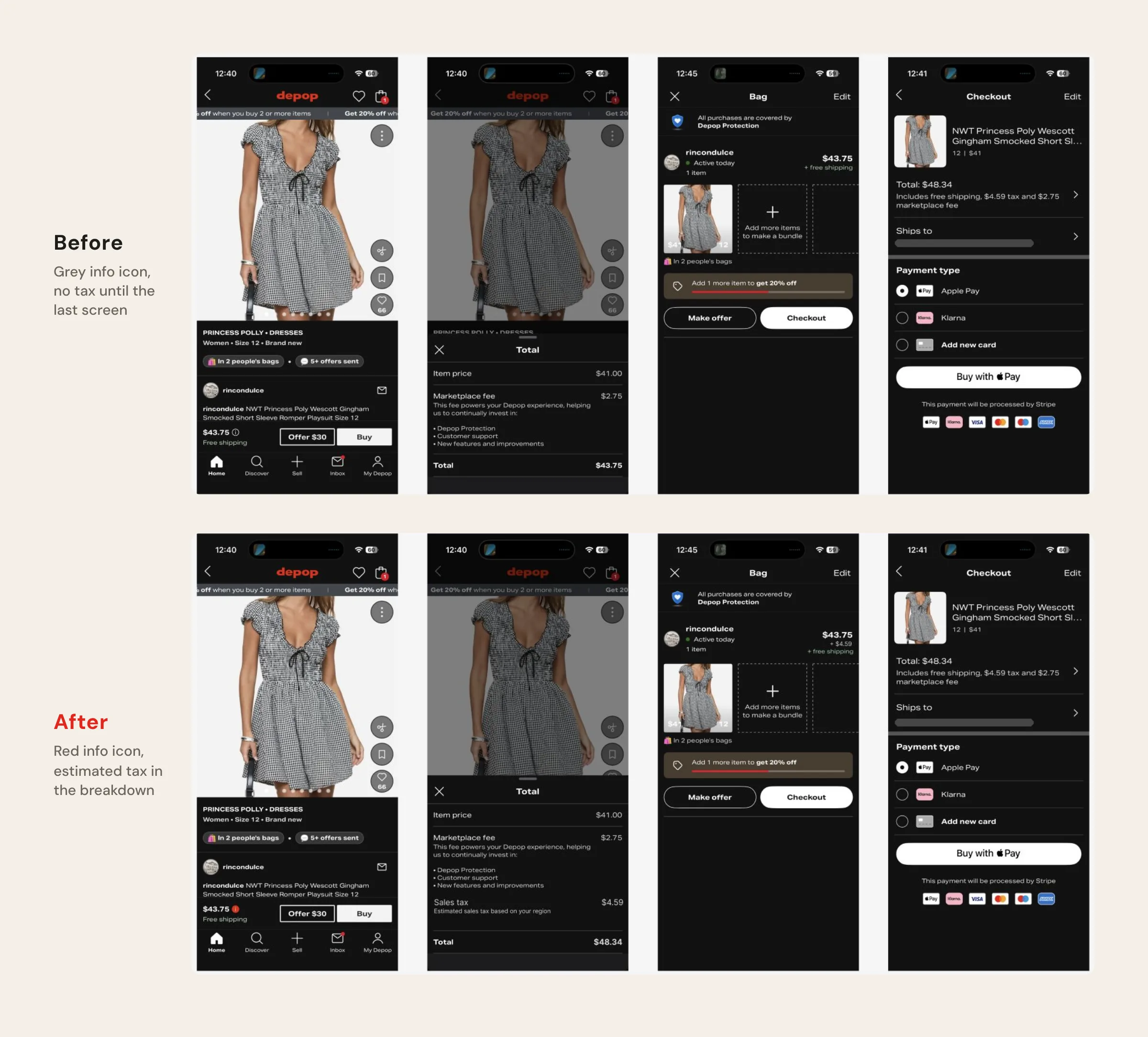
1
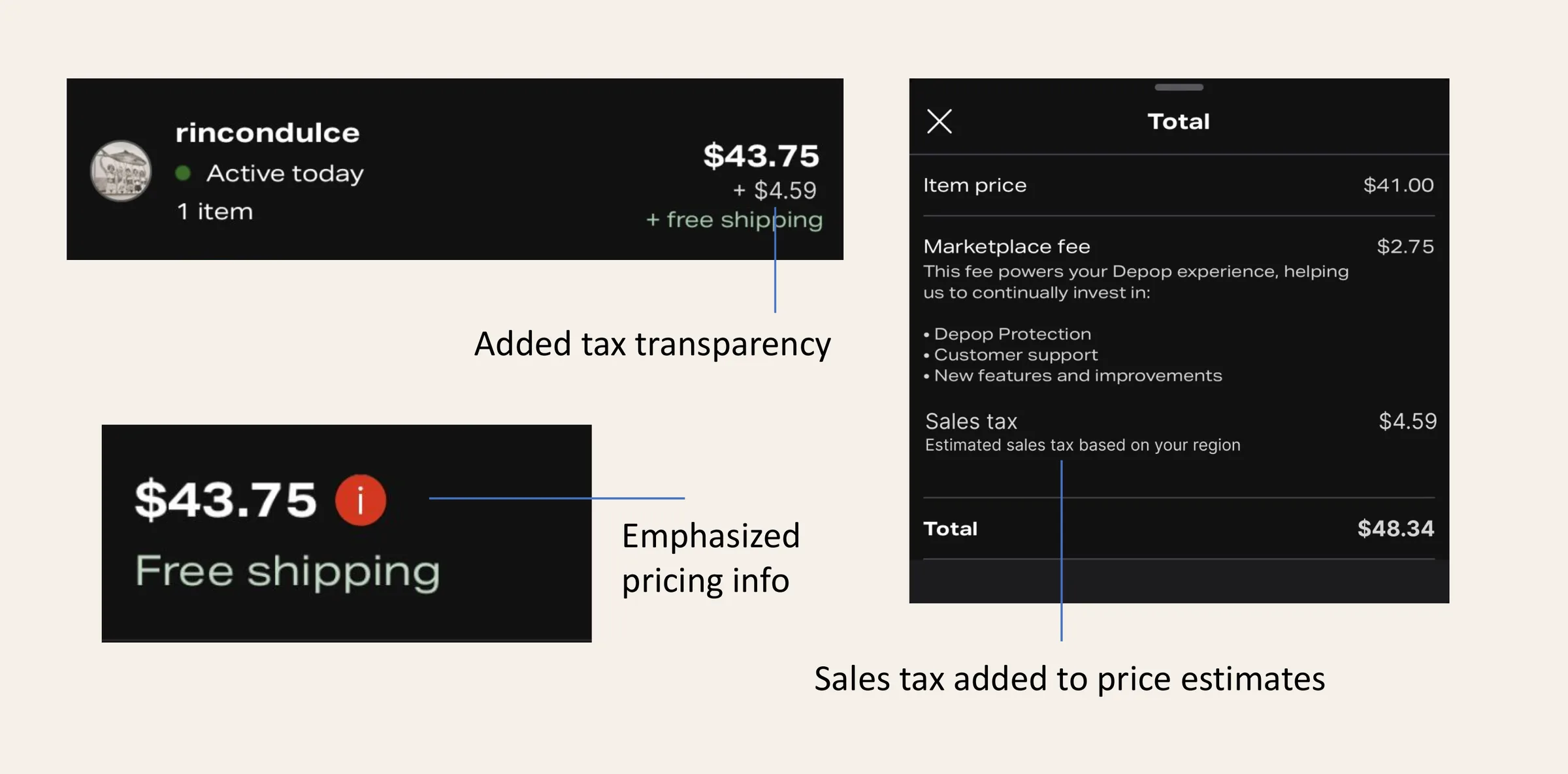
The info icon turns Depop red.
The icon beside the price already opened a cost breakdown, but it was grey and easy to miss. In Depop red, it reads as something to tap.
2
The breakdown adds estimated tax.
The breakdown showed the item price and marketplace fee but stopped short of the real total. With estimated tax added, buyers see the full amount before they tap Offer or Buy.
In my mockup, the total a buyer sees before committing changes from $43.75 to $48.34, the amount they will actually pay.
What's next
This was a proposal, not a shipped change, so the next step is testing it. I'd compare how often accepted offers turn into completed purchases with and without the two changes, and watch whether buyers open the breakdown before making an offer.
What I learned: The smallest change can carry the strongest argument. Instead of focusing my effort on changing Depop's pricing, I found it more worthwhile to push for transparency, so both sides of the transaction have what they need.